Colour
Titian Mother by Tom Wood, 1985

- Rather muted colours have been captured creating a some-what cold atmosphere within the image. Relating to the cold tones, the subjects are wearing winter-wear perhaps suggesting the photo was taken during cold weather, which again, has been nicely captured with the tones of the photograph.
- Linking to the thought surrounding this being taken during winter, the fact that they are sat in a cafe could suggest that they have nowhere warm and safe to go during the harsh weather, and so the woman is sat there slowly drinking her tea so the baby can keep warm and healthy.
- Clearly natural lighting has been used here as firstly, the reflection of the window can be seen in-a-way framing the subjects, and in their eyes, but also because the lighting is particularly soft, whereas if artificial lighting had been used tit would be much harsher.
- This is a candid portrait of a mother and her child, where both of their expressions suggest they are deep in their thoughts, or even both focusing on the same thing outside (as their eyes seem to be looking toward the same direction). Relating to that, the woman’s pose comes off as slightly protective, showing that even when naturally trying to relax, she still has constant responsibility over that child.
- It is a well balanced image as the subject’s fill the majority of the frame, and are sat pretty much directly in the centre of it. A shallow depth of field has been used which is clear due to the fact that both the background and the mug are out of focus, where as both subjects are sharp and visible.
- Going back to the clothing, their clothes to me come across as rather dated suggesting it was taken some time ago and not in recent years.
- CONTEXT: It is in fact a photograph of a young mother and her daughter in Liverpool taken in the year 1985 from the series ‘Photieman’ by a man named Tom Wood. This image in particular from the series is called ‘Titian Mother’ coming from the painting named ‘Madonna and Child’ by an Italian painter named ‘Titian’. It is all surrounding the thought of a young single mother doing her best for her child, giving it her all even if she has not much to give. It is almost a symbol of strength and stillness, like the Madonna and Child.
More on who Tom Wood is (as a photographer):
Wood is a portraitist, street and landscape photographer based in Britain. Through-out his photographs there is a running theme where he likes to go to certain places then really capture the atmosphere and life that the location brings. For example, Tom did a series where he went to Liverpool and really captured the reality of what life was like to be living there during those times – he managed to show the emotions and mood of the people who lived there, the clothing style and even the difficulties and harsh realities of their lives through setting and their real and natural facial expressions.
Here are some of my favourite photographs from his collection:


Judith Kerr whit her cat Katinka by Sam Pelly, 2011

- In my opinion this seems like a posed/staged photo as the objects on table seem rather organised and almost un-natural, making me assume it has been directed by the photographer.
- Natural daylight has been obviously used, suggesting she is sat . directly beside a window; i know she is sat to the side and not in front of the window as split lighting can be seen.
- The subject has created a rather relaxed and welcoming atmosphere for the photographer, as she has placed out 2 teacups, one for her and one for the photographer suggesting she treats Pelly as a guest, or perhaps even friend – She has invited him into her life.
- The subject doesn’t fill frame in this photograph which draws attention to the location and surroundings, showing that her background is as important as she is meaning that it is an environmental portrait.
- Although, she is framed by the cupboard and table making her seem of some what importance in the photograph.
- Settings: Low ISO? (dark interior), shutter speed around 1/125 (hand held), mid range depth of field as the majority of it is in focus, although the biscuits are slightly out of focus.
- It feels very domestic, comforting and homely making it feel familiar and bringing back memories of grandparents, (even her outfit seems traditional and relatable).
- CONTEXT: The subject is a children’s author/illustrator and one of her books is called ‘The Tiger who came to Tea’, which links to this image as her teapot has a tiger on so that in an instant connection, but also relates to the fact that she is holding a cat as tigers are cats.
More on who Sam Pelly is (as a photographer):
According to http://sampelly.com/about-2/ “Sam Pelly is a photographer, poet and artist. He received considerable exposure following his 2002 London exhibition “Broken Hearts”, a visual poem charting the birth and decline of Ireland’s architecture. He has recently shot campaigns for Pfizer, P&O Cruise & Sunseeker and photographs frequently for such publications as The Telegraph, Tatler, and Condenast Traveller. He is driven by light and life; by the richness of the human condition and by the magnificence and beauty of landscape. In between commercial assignments, he spends much of his time in the mountains of Andalucia in his old Land-Rover, Betty, with large format camera, canvas bedroll and stove, entranced by the infinite mystery of it all.”
Here are some of my favourite photographs from his collection:


Black & White
Albert Einstein by Yousuf Karsh, 1948

- This is a black and white photograph, as it was taken on a large format film camera. The tonal values are very strong as you can see a great contrast between the whites, blacks and various shades of grey – It is a monochromatic palette.
- The type of lighting that was used is low-key and artificial, more specifically the butterfly technique has been used. This is obvious due to the fact that it is a rather harsh and sharp light shining on him making it artificial, but also we know the butterfly lighting set up has been used due to the shadow sitting under Einstein’s nose. A catchlight can be seen in his eyes as the lights were places above and in front of the subject, giving him a sense of life.
- Relating to that, although his eyes are sparkling and lively from the light, his eyes are actually looking away from the photographer, Karsh. By him looking so seriously away from the photographer it could suggest that the subject is perhaps an important man with a serious profession – he is possibly looking into the distance at his goals and wondering what more he can do in the future with his knowledge and power.
- Linking to that, by him filling the vast majority of the frame it could show that he is of high status – he is of great importance and well known. (Because he does not need any wild and crazy props around him to make the image eye-catching – he is the eye catching thing due to his status). People want to look at him.
- Technically, the rule of thirds has been used in this photo. I can see this as his head is more toward the left side of the image, where-as his hands are positioned more on the right so it balances out the photograph. A shallow depth of field has been used to make the subject stand out to his fullest potential, meaning a low f stop had been used; (His face is sharp yet his arm and background is not).
- CONTEXT: This photograph of Albert Einstein was taken in the year 1948 by Armenian-Canadian photographer Yousuf Karsh.
More on who Yousuf Karsh is (as a photographer):
Karsh was an Armenian-Canadian photographer who lived from 1908-2002. He was mostly known for his portraits of well known and important people/celebrities such as Queen Elizabeth, 1951 (who at that time was a princess), Audrey Hepburn, 1956, and Martin Luther King, 1962. He is described to be one of, if not the, greatest portrait photographers there has ever been for his black and white film photographs of such iconic legends.
Here are some of my favourite photographs from his collection:


Audrey Hepburn by Angus McBean, 1950

- Back when McBean was alive and thriving in the photography community he of course used a film camera (this is obvious due to the date it was taken). Because of this it was of course taken in black and white. Although colour may not have been an option for him, i feel like the soft grey, white and black work really well. The softness of the tones really add a sense of gentleness and softness to not only the subject, but the image as a whole.
- Due to the background, it looks like this portrait of the gorgeous Hepburn was shot outdoors. It looks as if the sky and some grass are behind her showing it wasn’t taken it a studio. Having said that, in her glasses a artificial light can be seen suggesting that artificial light was also used. The used of both natural and artificial lighting have created a very soft yet clean and sharp finish. The sun has caused her skin to glow and look so smooth – it really compliments her; whereas the artificial light has caused all of her facial features to look sharp and creates strong contrasts within the black and white tones.
- Zooming in on the subject, she fills the majority of the frame. This could suggest that she is of importance as people would be drawn the the image for her, and not anything going on around her.
- Linking to that, this almost looks like a portrait for a fashion magazine due to how glam her make-up and hair are; this shows that she could have been a well known fashion icon of her time which again adds to the thought that she was of great importance.
- CONTEXT: Throughout his photographing career, McBean often photographed British actor, model and dancer Audrey Hepburn. She was extremely well known all around the world and was active during “Hollywood’s Golden Age”. This shows that as a photographer he must have been highly rated as he was able to photograph some of the, at that time, most famous people.
More on who Angus McBean was (as a photographer):
McBean was a Welsh photographer, set designer and cult figure associated with surrealism. His love for photography began whilst he wan in college, as he started to become fascinated by the apparently magical properties of this process, Angus wanted to be able to take pictures of people and sold a gold watch left to him by his grandfather to raise the five pounds necessary for the equipment.
Here are some of my favourite photographs from his collection:


Experimental and innovative
Joiners series by David Hockney, 1980

- Although this is a colour image and not black and white, the tones are not particularly bold or bright meaning they are not very eye-catching. -They are rather muted, although this could just be because it was taken on an old camera.
- Relating to the vibrance, or lack there of, i think that natural lighting was used to take this photograph. This is due to the fact that firstly, if flash (otherwise known as artificial lighting) was used, then it would have reflected onto the subject’s glasses lenses; also, i feel as if it is not bright enough to have been lit my artificial lights. On the other hand though, the colours look to have been slightly saturated due to the orange tint, although this could just be down to the type of film or camera used. Saying that, it is clear that the light source came from the subject’s right hand side, as that is the side in which the light hits him the strongest.
- Due to the fact that the subject is dressed well in a suit, and has a rather serious expression on his face, it suggest that perhaps he has a somewhat serious job (as his appearance comes across as formal, as if he is possibly a man of importance). Usually when it comes to serious portraits they would be put in black and white to really accentuate the mood and atmosphere created by the subject’s expression, so i admire how this is still in colour, even if they are rather muted, as it is something different and slightly unusual from a photographic perspective.
- Linking to the fact that he could questionably be a man of importance, in this collage portrait image the subject fills the frame, in-fact, multiple times. This could have been purposely done to make more prominent the idea of him being important – He does not need anyone or anything else to surround him to fill the frame or make the collage portrait more exciting or eye-catching. Like in the previously analysed portrait of Einstein, people just want to look at him.
- Talking technically, it is hard to tell what kind of photographic techniques were used as it is multiple images merged into one, but the obvious technique is collage. The subject has been repeatedly photographed in the same place in one sitting, slightly moving around to capture multiple angles of him. They have then all been put together to create 1 piece of art.
- CONTEXT: “In the early 1980’s, English painter David Hockney began creating intricate photo collages that he called “joiners”. His earlier collages consisted of grid-like compositions made up of polaroid photographs. He then switched to photo lab-processed 35mm photographs and created collages that took on a shape of their own, creating abstract representations of the scenes he had photographed. The varied exposures of the individual photographs that make up each collage give each work a fluidity and movement that otherwise might not be found.”
–https://artfilmsblog.wordpress.com/2017/09/06/david-hockney-joiner-photographs/
More on who David Hockney is (as a photographer)
Hockney is an English painter, draftsman, printmaker, stage designer and most relevantly, a photographer. Some of his most well known pieces are from his joiners collections, and also his LA swimming pool work; in-fact he is so well known that in 2011 he was voted the most influential British artist of the 20th century.
Here are some of my favourite photographs from his collection:


Alexander Straulino
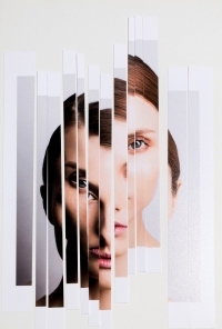
- Despite the fact that this is a coloured image, it is really not very vibrant or eye-catching. The use of a natural and toned down palette means that no colours pop out and excite you or cause you to want to look at the image. The thing that does this is the way in which the portrait has been manipulated. Having said that, i think the toned down colours give this piece a rather fresh and clean feel, as they are so pure and calming.
- I know that artificial lighting was used to light this portrait as due to the sharp lines and catch light you can see that it was taken in a studio, which meant studio lights must have been used. More specifically, i think that one light was placed behind the subject and to the side (out of shot) directed on the backdrop to light up the surroundings, and on the same side a light was focused on the subject at a 45 degree angle and slightly looking down on her. This is because it almost looks as if a split lighting was created, but the shadow is not completely solidly split down her face, which led me to believe the light was at a 45 degree angle and not 90.
- The subject in this portrait is filling the majority of the frame meaning that all focus is on her. This could be just and artistic point of view, or possibly suggesting that she is of some-what importance; she does not need anything around her to add emphasis to her or the image as a whole.
- Relating to that, the use of a plain background adds to the fact that she is meant to be the main focus and needs nothing to take away from her.
- Talking more about the manipulation, i think the photographer/artist created this by just simply printing out the portrait then cutting it into slices using a guillotine, then placing it back together in order but in an uneven positioning to create a distortion in the face.
More on who Alexander Straulino is (as a photographer)
“One of Germany’s most lauded photographers, Alexander Straulino creates images of unparalleled stylistic perfection. With his eagerness to experiment and aesthetic boldness, Straulino’s photographs feature an abstractness that borders on the alienating. Tending towards the richly-coloured and exotic, a Straulino image turns models into sculptures, with a whiff of eroticism touching both consciousness and the unconscious at the same time. In this way, Alexander Straulino offers the spectator his very own answer to the all-important question of what beauty is really all about.”
–https://models.com/people/alexander-straulino
Here are some of my favourite photographs from his collection:


